

Whilst looking at another illustration with stairs on it, it inspired me to add a viewing platform to the image. It splits up the composition in a nice way, adding a line of sight and a few points of interest, but thematically I think it is interesting too- as a visual metaphor for the way we view and distance ourselves from riot and protest.

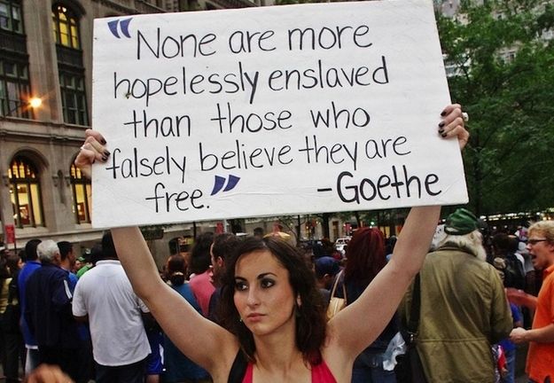
I started to think about what signs to put on the 'mob'. Real, specific signs are possibly more powerful but focusing on a specific cause maybe takes away from what I am trying to achieve.

And with that I started to consider the lettering on the signage. Most signs are handwritten or typed with little consideration for design, which is fair enough. But it's hard trying to create something that looks realistic, or believable rather, as well as aesthetically in tune with the rest of the illustration. I wonder if my own handwriting would naturally be in touch with the rest of the image.


I started drawing a lot of faces to get into the swing of what kind of thing I wanted to draw. I'm not sure there's much room for detailed features in a melting mass though.

I also considered adding full, more formed bodies to the mass, to get that sense of movement but also a sense of entanglement.

And I started to consider what the viewing people will be doing. To reflect real life, I think there will be a fair number of people who ignore the mass, or watch it through smartphones. Those who do look may well be concentrating on the 'bad' aspects- i.e. looting with no concern for those in pain.
No comments:
Post a Comment